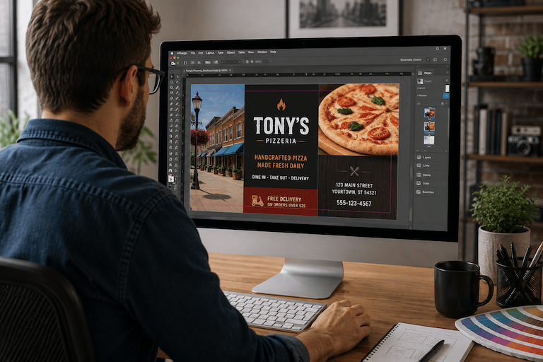
Your flyer looks sharp on screen. The colors are bright, the photos are clear, and the headline stands out.
Then you print it, and something feels different.
That gap between screen and paper is behind several common print design mistakes. Fortunately, you don’t need professional design training to avoid them. A few basic checks can help prevent disappointing results, unnecessary revisions, and materials that are harder to read than you intended.
Mistake #1: Expecting Your Screen to Match Print
A monitor creates color with light. A printed piece uses ink or toner on paper. Because the two reproduce color differently, what you see on your screen is not an exact preview of the finished piece.
Monitor brightness and settings can change your perception, too.
The fix: If a brand color, photograph, or other element needs special attention, tell us before production. Ask what you should expect and whether the file needs adjustment.
Mistake #2: Making Contrast Too Weak
A good-looking color combination can still cause trouble if customers struggle to read it.
Light text on a pale background, dark copy over a busy photo, or colors with similar visual weight can hide important information.
The fix: View the design at approximately its finished size. Can you quickly spot the headline, offer, contact information, and next step?
If you have to search for them, your customer probably will, too.
Mistake #3: Letting Color Compete With Your Message
Color can guide attention and reinforce your brand. But if every element is bold, nothing gets to lead.
Think of a promotional handout with several bright colors, multiple graphics, highlighted phrases, and competing calls to action. The reader has no obvious place to start.
The fix: Give color a purpose. Choose a dominant direction, use supporting colors selectively, and save your strongest contrast for the information that deserves attention first.
More color isn’t automatically better color.
Mistake #4: Overlooking Image and File Quality
A strong layout cannot rescue a blurry photograph, pixelated logo, or image stretched far beyond its original size.
This often happens with images taken from websites. They may look fine on a monitor but lose quality when enlarged for print.
The fix: Use the best-quality original images and logos available. Check them near their intended printed size.
If something looks questionable, ask us to review it before production.
A Better Print Piece Starts Before Printing
Before sending your next flyer, menu, handout, or other color project to print, check four things:
- Are your color expectations realistic?
- Is the important information easy to read?
- Does color guide attention rather than compete for it?
- Do your images and graphics look sharp?
Avoiding common print design mistakes doesn’t require becoming a designer. It requires knowing what deserves a second look.
Have questions about your file, color choices, or image quality? Talk with us before your next project goes to print. A quick conversation can help you move forward with more confidence.


Leave a comment